Friday, October 28, 2011

SSSC140

Hi everyone!

Although it's been a busy week, I did find some time to work on the latest sketch over on the sweetest thing site. Here's the latest sketch.


I love sketches that repeat patterns/images and this sketch was right up my alley! I wasn't quite sure what I'd do for the 5 repeating images but here's my card!
I started out with some pattern paper and kraft-colored cardstock. I wanted the brown to be a bit richer in tone so I inked it with some vintage photo distress ink. Then, I adhered the pattern paper and cardstock, added the green ribbon, and then grabbed my heart punch. The punch actually cuts out 2 hearts, the large one on the side of the ribbon AND the small one from the center of the large heart. I LOVE this punch! I punched out 5 hearts and used the small hearts for the repeating image/design element. I then added some glossy accents to the small hearts and used a white pen for some faux stitching around the bottom portion of the card. I stamped the sentiment and then re-traced the sentiment with a brown pen to make it stand out a bit better. Fun sketch and a fun card! :)

Hope everyone has a great weekend and thanks for stopping by!
Pat

Wednesday, October 26, 2011

CFC #25 and Tuesday Trigger

Hi again!

I am squeezing in just in time for the CAS-ual Fridays challenge. The challenge this week was to add color to any stamped image. And I knew just what stamp I'd be using.

For the Tuesday Trigger on the Moxie Fab site, it was a beautiful wall sculpture in autumn leaves...which is the direction I was heading for my stamp. Here's the wall sculpture.


Truth be told, my local craft store had a challenge for this month, too, and it meets this coming Tues. night. I knew I needed to start working on the card and I had already picked out the stamp for that particular challenge. Their challenge was to make something more "vintage" looking and they provided us that pin on the vase. So, here's my take on the challenges.
I started out by stamping the olive green cardstock with the "friend" definition stamp by Hero Arts in vintage photo distress ink. Then, I used my "happy" definition stamp and using broken china distress ink I stamped that on white cardstock. Then, I used my versamark to stamp the floral vase image from Hero Arts and heat embossed it with clear powder. That's when the fun begins! I took my vintage photo distress ink and inked the vase. Then, using the mustard seed, spiced marmalade, and barn door distress inks, I inked the leaves. After it was all inked, I spritzed some water on my craft mat and blended the colors with a paintbrush. I added the vintage-looking pin provided by my scrapbook store. I then mounted the image on a burgundy cardstock and stamped the sentiment. I really like how it looks like a blue sky is in the background b/c of the blue text...and I love the autumn colors!

Thanks for stopping by!

Monday, October 24, 2011

Lily Pad's Sketch Challenge

Yes, 2 posts in one day! Although, it's still another sympathy card. Sigh.

Once again, there's a great sketch you can play along with at the Lily Pad Cards website. I needed some inspiration for this sympathy card and this sketch was perfect.

Here's the sketch:


And here's my take on it.
I started out with 2 pattern papers from The Luxury DCWV stack. I added some blue ribbon with some pearls. For the sentiment, from Hero Arts, I used Staz On Black ink. I stamped my floral image with broken china distress ink and inked the edges of the label. A quick card but the papers are so beautiful that I couldn't resist using them!

Have a great week and thanks for stopping by!
Pat

In our prayers

Hi everyone!

Today I share a card for a dear church family that has recently lost a loved one. He was a great man...so kind, sweet, and always had a smile on his face. His wife treated him with such love and dignity all the way til this past Friday when he went to sleep in Jesus. So, I wanted it to be a special card...

Here it is.
I started out by inking my purple cardstock with some dusty concord distress ink. I wanted it to be a really rich, royal color purple. Then, I took my Penny Black stamp and stamped it in white pigment ink and heat set it with some white embossing powder. Then I reached for my Perfect Pearls. The picture doesn't really do it justice to how shiny the card is in real life. But I took some gold perfect pearls and mixed it with some water. Then I used it as a watercolor background. It looks so pretty! Then I used my border punch on both the image panel and the one behind it and added some purple rhinestones to add a pop of color again. I added a strand of purple ribbon and then mounted the sentiment on top. The sentiment is from Hero Arts and I stamped it using my versamark pad. Then, I added the gold perfect pearls to the sentiment and spritzed some water on it.

Can't wait til Jesus comes back so I don't have to make these kinds of cards anymore...

Take care everyone...
Pat

Sunday, October 16, 2011

CPS 240

Hi everyone!

Well, after such a long break from making cards, I was finally "in the mood" to work on one tonight! :) I was inspired by the great sketch over at the CPS site and figured I'd give that one a try. Here's the sketch:


Here's my take on it:
I've had this Hero Arts stamp for a long time! I saw a card that one of my fave crafters, Jennifer McGuire, did with it and I was dying to try it out. Hers was stamped in a metallic silver but I did love the technique that she used.

I started out with white cardstock and I stamped the image using an orange pigment ink. Then I heat embossed it. I wanted it to look like it was sunset--hence the orange...That's when the fun began! :) I used my fantasstix tools and started coloring in the image with distress inks. I would first dip the fantastix tool in a bit of water and then grab some ink right off the ink pad. The flowers were inked with a milled lavender and then with dusty concord. The leaves were first inked with shabby shutters green and then with pine needles green. After the image was colored in, I used a paintbrush that was dabbed in water to smooth out the coloring. I mounted the panel on white cardstock and then started working on the background. I knew I wanted a purple background. But the color cardstock I had was the wrong the purple--too red. So, I grabbed my dusty concord distress ink and colored in that wrong-colored purple cardstock and transformed it in the rich color I wanted. Then I realized I needed something else for the background. I used the "Happy b-day" definition stamp from Hero Arts and stamped that in silver pigment ink. I stamped the sentiment in dusty concord and cut half of a spellbinders label for the tag of the sentiment. The final touches were just adding some pearls on 2 corners of the card and it was done!

Hope you enjoyed the weekend and that you get to play along this week, too!
Pat

Quick sympathy card

Hi everyone!

I know, I've been MIA all week! Between having a little one with stomach and still trying to recover from pneumonia, getting into my craft room has been difficult! But last night my hubby informed me that he needed a sympathy card b/c he'd be attending a funeral today. These aren't the most fun cards to make, in the least, but I guess when someone is going through such a huge loss, the least we can do is offer a card telling them how sorry we are...

Here's my card.

Like I mentioned, I'm still recovering so I knew I didn't have the energy for a complicated card. I wanted something pretty easy yet classy. So, I found this pattern paper. It actually had the scalloped border and everything! All I did was mount it on some red cardstock that I added some vintage photo to and then added some brown ribbon. I used the cuttlebug for my sentiment label and then stamped the sentiment from Hero Arts using vintage photo distress ink, too. I had some fabric flowers from JoAnns and I added them to the corner of the label, put a button for the center of the flowers w/some twine and the card was done! Easy!

Hope everyone had a great weekend! I'm hoping to get back to playing this week!
Pat

Sunday, October 9, 2011

Kathy's Lily Pad Palette Challenge

I can hardly believe I was able to post 3 different cards today! THAT hasn't ever happened! :) But nothing beats having inked up fingers and this card surely gave me some inky ones!

The Lily Pad website has a great color challenge going on right now. Here's their color palette:


I'll admit that I wasn't sure if I'd be able to incorporate those colors but here's my take on challenge...
Turns out I had the greenish-teal color cardstock on hand and I chose to make that the base of the card. I then took white cardstock and inked up the "Happy" definition stamp from Hero Arts in Tea Dye distress ink. Then, using brown pigment ink, I stamped the Dancing with Flowers image from Hero Arts and heat embossed it w/clear powder. Then, the fun began! I took the mustard seed distress ink and inked the entire card. Then, about midway up the image, I added some spiced marmalade distress ink. Finally, I added some fired brick distress ink towards the top of the image. It looks like a great sunset--and what a great image of kids enjoying the sunset, too. I then mounted the cardstock on brown cardstock and used my EK Success punch for a border on the bottom. I added some yellow ribbon and then grabbed a paper flower, added some script writing to it, colored it lightly with fired brick distress ink, and added that to the panel. Then, I added a pearl colored button w/twine and stamped the sentiment. A fun card! Can't wait to play with this stamp in other color combos, too!

Hope you can play, too...
Pat

Color Throwdown 162 and RCC23

Yes, this is my 2nd post of the day! My men are still out enjoying the day so I have been having fun in my room... :)

This post contains a new challenge for me, though. Although I love participating in sketch challenges, I'd never done a color challenge before. But the great colors that came up for this week in the Color Throwdown were calling my name! Here's their swatch.
Also, the ribbon carousel site had an "anything goes" challenge where you basically just had to incorporate anything that came from a spool to participate. Since I love ribbon, this was an easy one to incorporate for me!

Here's my card.
I started out with some dark brown cardstock and I then layered a kraft-colored panel on top. I didn't like the look of the kraft cardstock, though, so I altered it a bit using tea dye distress ink. That looked a bit more rich to me. Then, I took some light yellow/cream cardstock and using my versamark dazzle pad, I stamped the damask (I think?) Hero Arts stamp on that. I heat embossed with clear powder b/c I wanted something subtle on the cream paper. Then, I cut out a sizzix label and stamped the sentiment in broken china distress ink. I looked in my very messy ribbon drawer and found this ribbon from Li'l Davis Designs that matched well with the colors. Finally, I stamped out a butterfly using the Martha Stewart 3 in 1 stamp and punch butterfly and adhered it to the label, too. I had originally envisioned a different card with bigger elements in blue but this worked, too.

Thanks for stopping by!
Pat

CPS 239 and Lawnscaping 19 Challenge

Hi everyone!

Hope everyone is enjoying their Sunday! I'm actually home alone--which means I get to play in my room! :) My men are off at our church's apple festival and, since I'm recuperating from a pneumonia bout, I'm home resting (and playing a bit, too!).

There's a couple of challenges I had hoped to sink my inky fingers into. The first was a sketch challenge from CPS. Here's the great sketch!


The other challenge had been posted for a bit but I'd been too sick to play along..til today! :) 
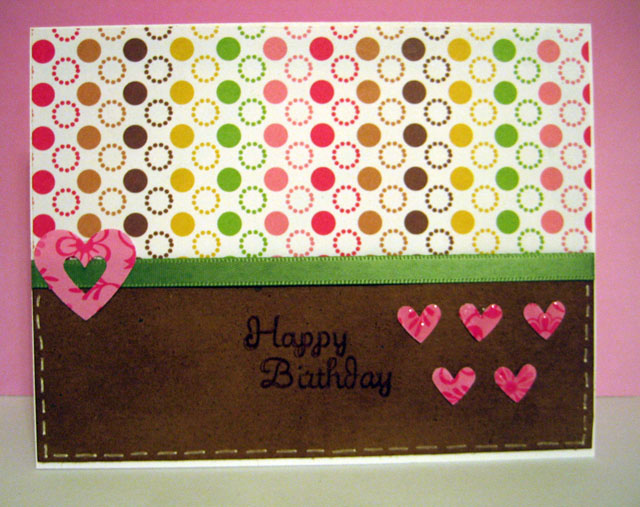
Lawnscaping's challenge was to do some layering/dimension elements on your card. Here's the official pic of the challenge.


The sketch lends itself to some dimension so it was great to incorporate both into my card. Here it is:
I started out with kraft-colored cardstock that I inked up using vintage photo distress ink. I then used 2 strips of KI Memories pattern paper that I cut using an old Creative Memories wave cutter. I punched out 2 circles--one in white and one in teal. The white circle I decided to use the script Cuttlebug embossing folder and add some dimension to the circle. The card kindda reminds me of going to the beach and the script seemed to remind me of writing in the sand. I changed the color of the circle, though, and used shabby shutters distress ink to have it give some more color to the card. When I started assembling the card, I kept thinking the brown background needed something. So, I took my "happy" definition stamp from Hero Arts and stamped it in vintage photo. Just wanted a subtle pattern in the background. I adhered the strips of pattern paper and the circles. But it was missing something...so I grabbed some pearls and that made me happy! :) I used a spellbinders label for the sentiment die cut and then stamped Happy Birthday in vintage photo ink.

LOVED the sketch! Hope you can play along!
Pat

Thursday, October 6, 2011

Clips-n-Cuts

Yes--2 posts in one day! :)

I stopped by one of my favorite blogs and saw the CUTEST video! Vicky made the cutest cartoon-comic strip card and she's showcasing Penny Black stamps. I've been watching her blog all week--she's on day 4 of the showcasing--and it's been great! Here's the link--and there's a give-a-way, too!

Sunday, October 2, 2011

Wee Memories Challenge 70 and CFC 22

Hi everyone!

I hope everyone had a good time this weekend making some cards! Although, technically, the weekend isn't over but I know many enjoyed World Cardmaking Day yesterday. I was busy almost all day but did make a quick card last night and decided to use these 2 challenges to enhance the fun!

The first challenge was from CAS-ual Fridays. Here's the challenge pic.
I knew I had some ribbon that had some loops on it and I hope this counts! :)


Over on the Wee Memories site, the challenge is basically to do whatever technique is your favorite. That's easy for me--I know it's gonna have some embossing on it! :)

So, here's my card.

It's a smaller card--I think it's 4.25x4.25. I started out with some light blue textured cardstock and embossed it with the swiss dots embossing folder from Cuttlebug. Then, I used my spellbinders label (#8, I think?) to cut out the white panel. I knew it'd be a baby card so I used an old Fiskars texture plate and used that to emboss the little hands and feet on the white panel. Unfortunately, the picture doesn't pick it up much. Then, I took some of the baby blue ribbon w/the baby bib loops and added it to the white panel. Added 2 buttons w/twine knotted through and the sentiment is on the inside. Quick card--but fun! :)

Hope you guys can play along, too!
Pat